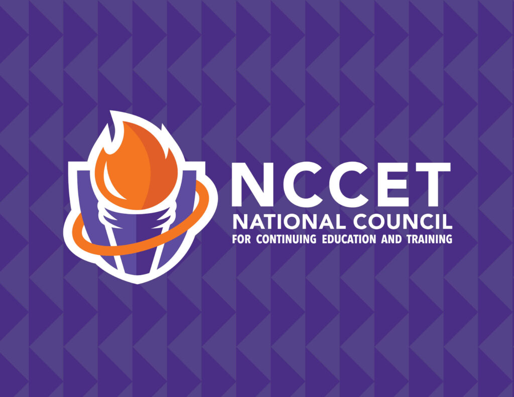
NCCET is a small but mighty 52 year old company that works with community colleges & universities providing support in the continuing education sector. Taking into consideration the history of the organization I came up with a logo that has multiple layers of symbolism.
Shields represent strength and power. With over 50 years of experience, NCCET clearly has staying power.
Often found in academia, a torch symbolizes tradition. Education is steeped in tradition and I wanted to portray NCCET as a guiding light in the world of continuing education.
The ring that encompasses both the torch and shield represents infinite possibilities and continuation to serve as a reminder to keep moving forward.
The accent pattern as part of the identity is a simple set of arrows that is a reminder to keep moving.


